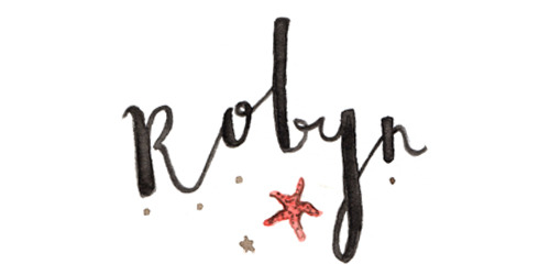
I decided earlier in the week that my blog needed a bit of a facelift, so I sat down today and worked on a new design after piecing together a colour scheme yesterday that I thought would work quite nicely.
All in all, I'm pleased with it. It's simple, easy on the eye, and doesn't demand that my blog is anything specific, which at this moment in time suits me just fine.


Your design is so gorgeous! x
ReplyDeletefashionismyfirstlanguage.blogspot.ie
thank you! :)
DeleteI love your new design, Robyn. It really is non-specific but it reminds me of lovely days on the beach so that is great. X Sjoukje
ReplyDeletewww.lemontierres.com
aw, i'm glad! thanks sjoukje :)
DeleteI love the new look Robyn, gorgeous xx
ReplyDeleteIoanna | Hearting.co.uk
I love it! :D
ReplyDeletethanks lauren! :)
DeleteIt's adorable!!! I love the colors and the new header is absolutely wonderful! Also we all get lost with our content sometimes, I'm sure you'll find yourself back into it :)
ReplyDeletePeace & Love // Celestralite
thank you! and i hope so, blogging's feeling a little more natural and enjoyable at the minute so hopefully my blog will begin to grow more organically again :)
DeleteThis is such a lovely new design! The header and the signature are really beautiful :) x
ReplyDeleteCharlotte's Road
Adore the new look! Absolutely gorgeous x
ReplyDeletethanks georgina :)
DeleteBeautiful design!
ReplyDelete