Showing posts with label graphic design. Show all posts

Tuesday, 1 December 2015

I finally graduated! ...and, er, got a job?!


Last Friday I made my last journey back up to Middlesbrough for my graduation, and besides a lot wind and a little bit of rain, it was a bloody good day. It was amazing to be back with the people I'd spent the last three years of my life with, and it was great to meet with our tutors and chat about what's been happening since our departure from university back in July. It was a day full of high emotions; elation to be together celebrating the fact that we'd all made it through the three years together, and a bit of sadness knowing that we'd probably never be back in Middlesbrough together again, but for me there was an overarching sense of nervousness because I was waiting for a phone call to find out if I'd been successful at a job interview or not.

Sunday, 5 July 2015

London | D&AD New Blood Exhibition 2015


Well, I did it, I became the person I never thought I'd be: a person who loves London.

Leaving London on Friday (however relieved I was to finally be resting my poor, tired feet) definitely brought with it a few feelings of sadness, and I suppose that's how I now know that it's where I see my future. I love the hustle and bustle, the fact that everyone has somewhere to be, the diversity, the excitement, the sheer amount of things there are to do, the fact that everyone heads to the pub after work, everything. Ok, perhaps not everything, but London definitely has an atmosphere and a vibe unlike anything that I've know while living in Barnsley and Middlesbrough over the last decade. It's ever changing, it's exciting, and I can't wait to one day live there and soak it up in all its glory. Actually, I'm not sure what the hell I'll do if I don't end up there.

Thursday, 29 May 2014

exhibition snippets


while browsing the end of year exhibition today and on tuesday, although i had a good ol' mooch around i didn't get the chance to take many pictures due to dedicated wine drinking, feeling a bit foolish and distractions in general, however i did manage to snap a few pictures of the corner of the exhibition where second year work was being exhibited and thought i'd share a few pictures with you all to give you a feel for what the rest of the exhibition holds. there was plenty to browse in terms of typography, motion and branding, however there seemed to be a lack of illustrative work compared to last year's show which for me was obviously a little disheartening, but prompts me to make sure i have plenty of lovely pictures to contribute to the overall exhibition next year.

and with that concludes second year! what an absolutely mental year it's been.
 

Thursday, 6 February 2014

my etsy shop / a sloth's guide to illustration


i recently added my 'a sloth's guide to illustration' zine to my etsy shop, so if you'd like a copy of your own you can do so by visiting the listing here!

as ever you can expect silly humour, hand gen type and a lot of sloths, but if you'd like to know more about the zine there's a full product description available on the etsy listing.

Wednesday, 22 January 2014

a sloth's guide to illustration


my latest module required me to create a piece of self promotional work that would be sent out to studios and companies that i may decide to to apply to for work experience throughout the summer, and i'll bet you're all extremely surprised about the fact that my work was sloth based! at the beginning of the module i struggled with the idea of promoting myself, but once i understood that it was more of a self directed project rather than something to promote me, the penny dropped and i realised that nothing made more sense than to use sloths as my project driver!


i knew that i wanted my piece to reflect my silly, light hearted outlook and personality as well as my illustrative style so i could be comfortable knowing that whoever opened my package knew exactly what kind of person was contacting them. i felt that this zine idea helped to honestly convey my tone of voice, my mind as a creative and how i work as one, too, and i feel that within the illustration world it's so important for your work to be genuine and an honest reflection of yourself.


we had to also consider a cv, covering letter and envelope design to be sent out alongside the promotional item, so i decided to keep the designs simple and relevant to the theme of my zine by sticking to a monochrome colour scheme and by using simple line drawings. i feel that this choice helps to display how my style works both in colour and monochrome as well as the fact that i can work on a more complex or simplistic level depending on what a brief may require.

in addition to our physical self promotion items, we were also asked to consider a digital solution that could be anything ranging from motion work to a simple pdf, so i decided to step a little out of my comfort zone and attempt a simple bit of motion in the form of an interactive illustration. i stuck with the sloth theme and the exploration of a sloth training as an illustrator, so i decided to create an image where a viewer could explore a sloth's creative studio. i linked my physical and digital pieces together through the creation of a character, dame olive napsalot, who is a well renowned illustrator within the sloth creative community who kindly offers up her advice about working as an illustrator which in turn becomes the content of the zine. at the end of the zine you're then presented with the opportunity to visit her website where you can explore her studio, which helps to make the content of the zine feel real and believable. if you'd like to explore olive's studio you can do so below, but please do excuse the dodgy quality - the .swf upload seems to have been a little odd?


i've had a lot of fun working on this module and it's reinforced the fact that i love writing my own material and having complete authorship over all of my work. my tutors have encouraged me to carry on making sure i put my stamp on all the briefs i tackle, so i hope i can get my teeth stuck into future projects just as i have this one!


Thursday, 9 January 2014

design juices feature

http://www.designjuices.co.uk/2014/01/second-year-graphic-design-student-robyn-makings/

hello, everyone! i'm just quickly popping by to let you know that i've been featured on the Design Juices website today, and if you'd like to take a peek at the article you can do so by clicking here or on the image above. 2014 has gotten off to a fabulous start for me, and i'm crossing my fingers, toes, eyes and whatever the hell else i can cross in the hope that 2014 continues to be just as exciting for me! *internal squealing*

Saturday, 14 December 2013

university project: advanced digital communication

since starting back at university at the end of september, we've been working on a brief called advanced digital communication. it was split into two parts: the first 4 weeks(ish) focusing on motion and interaction work and experimenting, and the second 4 weeks looking at a 'proper' brief - i say proper because i found it extremely difficult to feel like anything from the first half was going anywhere.

during my many battles with motion and after effects, i decided to give up on the program and opt for a more traditional way of creating motion - stopmotion. i felt much more comfortable working in this way and felt that the outcome represented my personality and style more accurately, and while my final piece was perhaps a little unfinished, overall, i'm not too ashamed to show it.


next on the agenda was to look at creating an interactive piece of work. i was a bit fixated of the idea of touch and how we make decisions every day based on things we do and don't touch and for a while i liked the idea of proposing an interactive keyboard with all the keys made of different materials - some nice, some not - and then monitoring how we adapted our language when communicating based on what we did and didn't want to touch. as it sounds, this idea was a little too elaborate to go about producing or simulating, so i left it there.

still focusing on the idea of touch, i noticed how we're often reluctant to interact with fragile things through fear of damaging them, and i wanted to create something that left someone with conflicting desires as they'd want to look at my artefact, however they also wouldn't want to through fear of damaging it. my solution was this interactive book that was made up of illustrations printed onto tracing paper, and it invites you to unpick the many layers of illustrations with pieces of card that are supplied, however to do so means you're at the risk of damaging the book.


onto the main (and more exciting) part of the module now! we were given a choice of two briefs: one based on mima's contemporary jewellery collection and one based on a british film festival. knowing i'm not much of a film fanatic, i opted to tackle the jewellery brief which within it specific making the jewellery accessible to children which was instantly right up my street. i explored the #wearmima facebook page and, much to my surprise, was really taken by some of the jewellery. i also watched videos from the vimeo page and noticed how the jewellery seemed to bring out everybody's inner child as they spoke of fantasy lands and the characters the jewellery could've belonged to, which instantly got me thinking of potential back stories for the pieces.
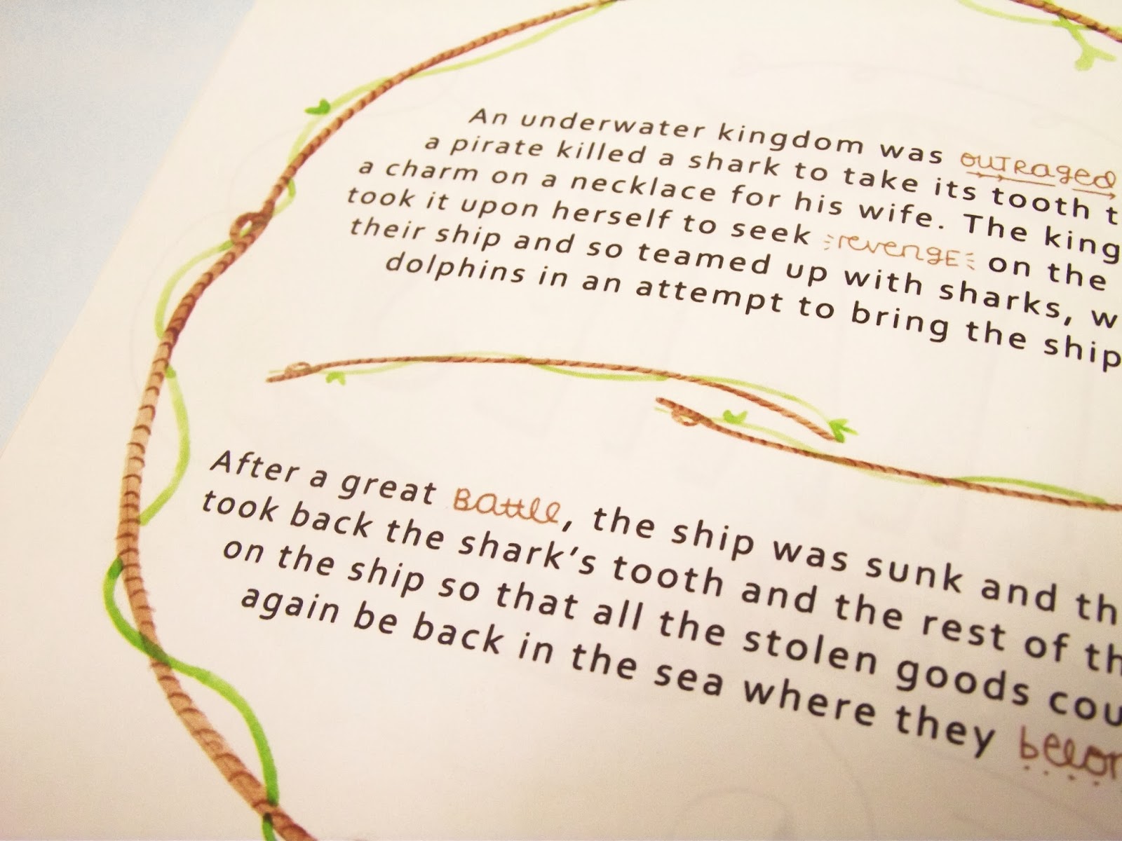
after creating back stories for four of my favourite pieces, my solution was to put these stories into a promotional booklet that would then be sent out to primary schools to be read by the children in an attempt to spark an interest and curiosity about the jewellery which would then get them into mima visit the jewellery in the flesh. the booklet also invited them to create and draw a back story for a piece of jewellery from the collection that wasn't covered within the booklet, with some optional starter stickers for the younger end of my audience to use if they needed a bit of help getting started. this feature also linked to an app that i designed where children could read about the pieces in the collection, upload their story and view stories others had created in an attempt to create some sort of community and make the kids and their contributions feel valued.


i wanted to include the final artwork for the entire book, however this post was already extremely picture heavy so i decided against it - hope you've enjoyed reading!

Wednesday, 9 October 2013

nss poster design


so the other day i mentioned the dreaded nss brief we're set every year, and here's my design for this year. my design was disregarded because it didn't communicate directly enough (which is true,) however in the feedback session i was told that my idea was fun and cheeky and would probably work, so i pursued it. regardless of whether or not my idea was direct or clichéd enough, i'm pretty happy with the whole concept i came up with and the visual style of the poster, so i submitted anyway because, well, there was no harm in entering, right? the worst that will happen is i'll hear nothing back, no big deal. i'm trying really hard at the minute to create work that i like and work to briefs in a way that is true to my style in terms of both visuals and ideas, so i think that although my design probably isn't 100% suitable for the brief, it is true to my style and that's the thing i'm really trying to focus on in second year, developing my own personal style. i want to eventually be at a point where i like what i'm creating so that i can be 100% confident and passionate about my projects and be able to talk people through my concepts with total ease.

Monday, 7 October 2013

fold: the fight against cosmetic animal testing


 this post turned out to be rather image heavy, oops!

over the summer, one third of my summer project was to research a topic or event that was important and create an artefact based on your research that in one way or another incorporated a fold. as soon as we were given the brief back in may, i knew instantly that i wanted to look into the ban on cosmetic animal testing that was passed in the eu in march because a) i found it interesting and b) it meant that in one way or another, there was room for bunnies in my work (which is always a good thing.)

my artefact is a sort of leaflet/infographic hybrid that would be distributed by cosmetic stores such as perhaps boots and lush within shopping bags to help educate their customers on the recently passed eu ban and the rest of the world's stance on cosmetic animal testing (which in most places is a little lazy, i discovered, tut.)

i decided to continue to practice with two things that i've previously struggled with - type and colour - and i think i'm finally ready to tell myself that i can work with type and colour in a way that is somewhat effective, hurrah! i also decided to come out of my comfort zone and ditch a paintbrush for a tablet pen in order to see where working digitally could potentially take my style, and although in parts it's been a bit of a slog, i think i'm finally starting to feel more comfortable with the idea of working digitally, and should hopefully over the coming months develop a stronger, more consistent digital style (although i will be picking my pencils and paintbrushes up along the way, too.)

since researching cosmetic animal testing and discovering which brands are happy to conduct animal tests where the government requires it (i'm looking at you, china,) i've been disappointed to realise that a lot of my favourite products are far from cruelty free. as a response to this, i'm currently on the lookout for new beauty products that are cruelty free to switch over to when i've used up the products i'm currently using, so if you have any cruelty free recommendations for haircare, skincare or make up, i would absolutely love to hear from you!
 

Friday, 24 May 2013

first year is over!

work by kerry neesam

work by craig ainsley
 
work by liam dobbin


 work by maiken garen

some first year book work on display

it was really nice to see a couple of my own projects on display!

 some work by my fabulous friend josh!
 and finally, a cake a classmate made to celebrate the end of the year

when our tutor told us that first year would fly by, he really wasn't kidding! while it doesn't feel like i've been at university for the whole nine months that i have, i definitely feel that i've improved masses since the day i started there! i've had a bit of an up and down journey this year regarding my feelings towards the course, but i can happily say now, at the end of the year, that i think making the decision to come to university was definitely the right decision. i feel that it's helped to push me and given me the motivation i'd otherwise struggled to acquire, helped me meet a wide range of talented individuals, given me the insight of my tutors and will (hopefully) give me the opportunities to make valuable connections with people within industry (fingers crossed!)

this week i attended the third year exhibition and was blown away by the quality of the whole exhibition, from the quality of the work to how the studios were set up. the quality of the work displayed has helped to give me an idea of the level that i'll need to have brought myself up to by the end of year three, and in other places has inspired me to push and better myself as an illustrator; it's nice to know that when i graduate, if i want to, i can refer to myself solely as an illustrator. throughout this year i've realised that graphic design, as a general term, isn't particularly where my interests lie, so having the knowledge that i can make my course what i'd like it to be is comforting.

naturally i was drawn to the illustrative exhibited pieces, but i tried my best to capture some other elements of graphic design to share with you in this blog post. i've credited relevant designers/illustrators under their work so please check out their twitters/websites if you like what you see!

all in all, a good first year. i've worked hard and i've achieved grades that reflect that fact, so hopefully in two years time i should be able to graduate with a good degree. here's to two more years of hard work!